Progress as the product
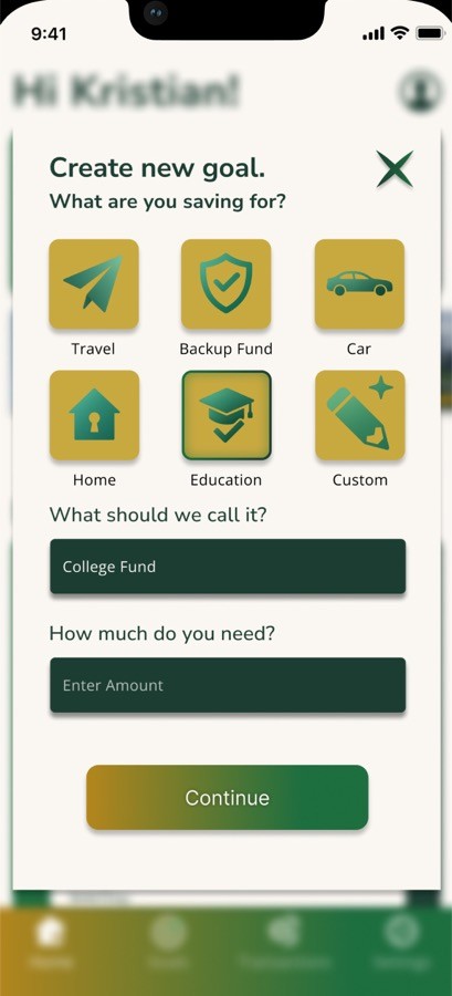
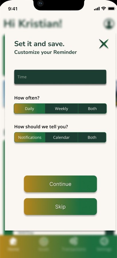
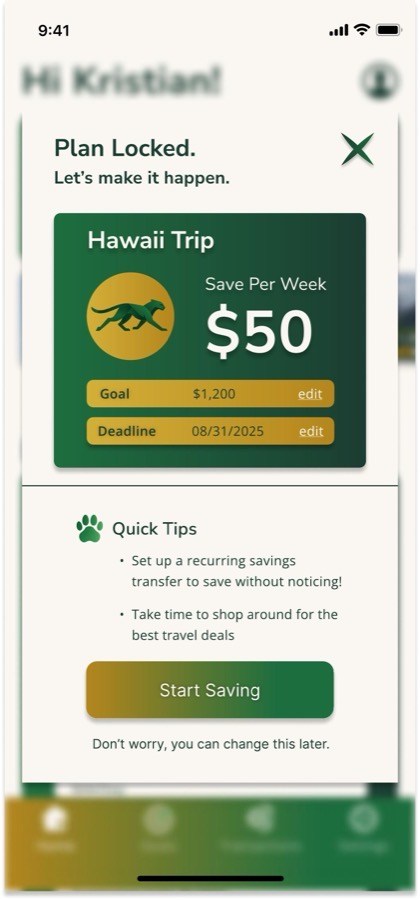
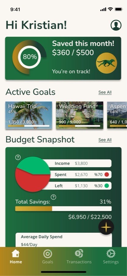
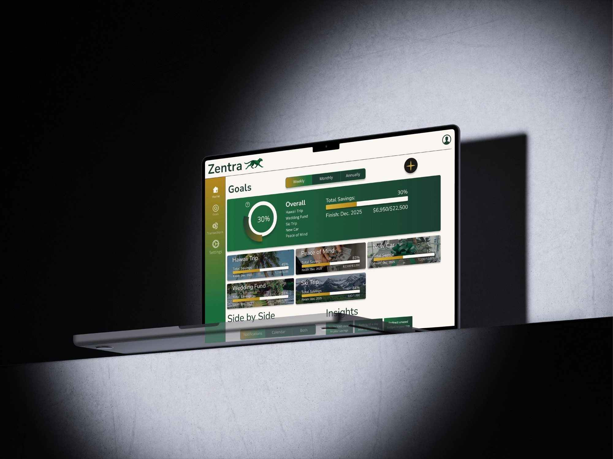
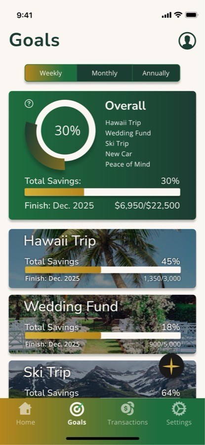
Zentra organizes saving around goals instead of one abstract balance. A vacation, emergency fund, wedding, or car becomes something visible and measurable rather than disappearing into a total.
Progress rings, percentages, and dollar amounts turn "I should save more" into something concrete: where I am now and how far I have left.
Identity built around momentum
Zentra needed to feel like progress, not paperwork.
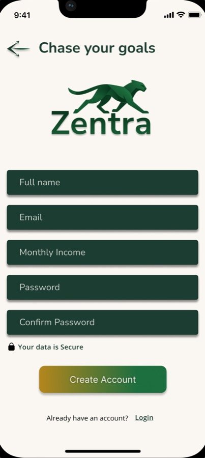
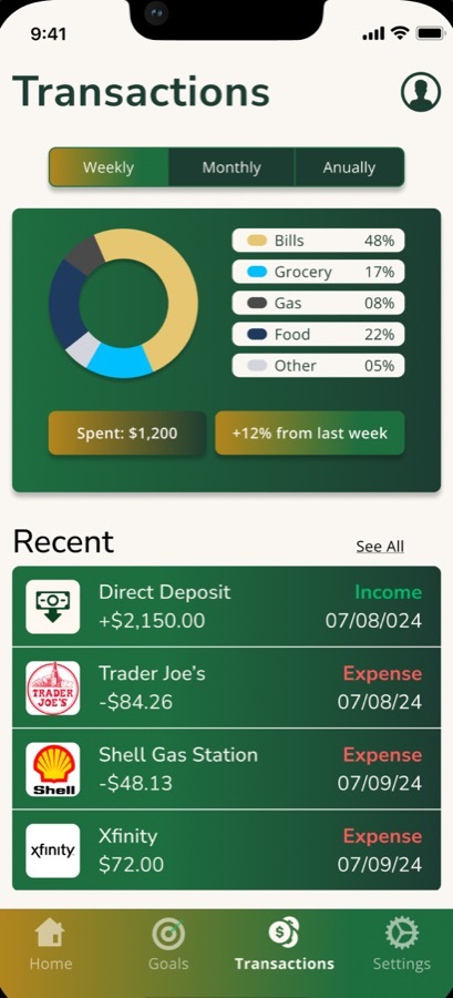
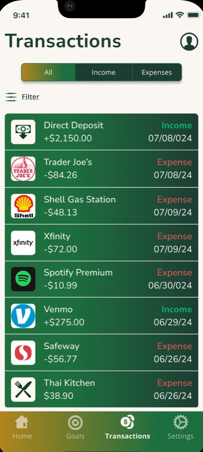
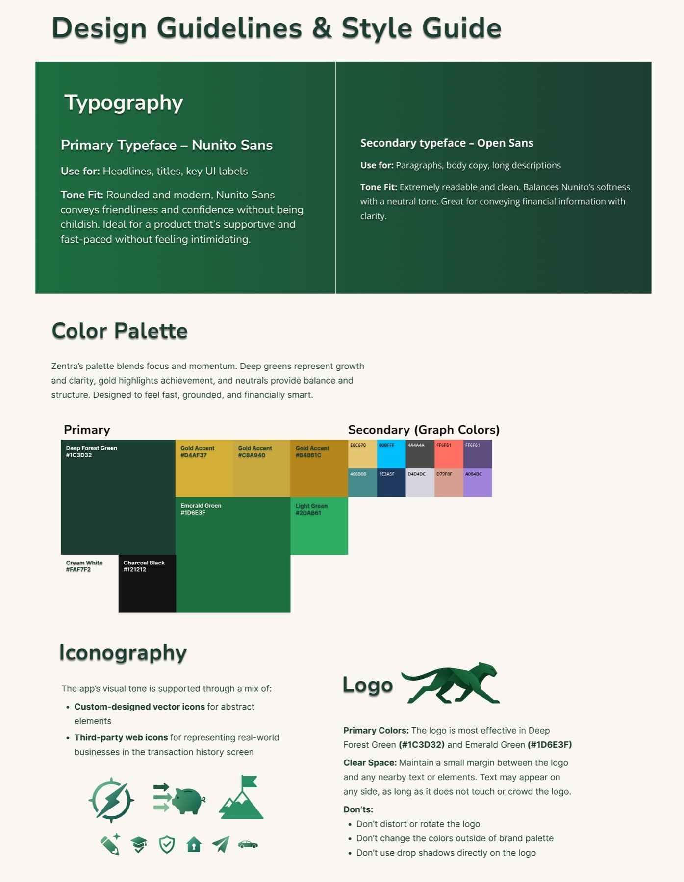
The cheetah mark gives the identity a sense of motion, while deep green and gold carry through the interface as the core visual system. The mark also becomes part of active states, including the loading experience.
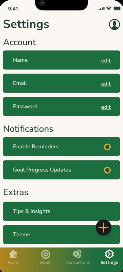
Nunito Sans and Open Sans keep the product approachable and readable without making a financial tool feel overly clinical.
Testing changed the interface
Three usability sessions surfaced real friction. Each one led to a specific change.
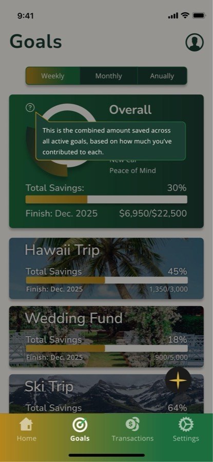
- Users wanted more context for how savings figures were calculated
- added tooltips that explain the calculation where the number appears
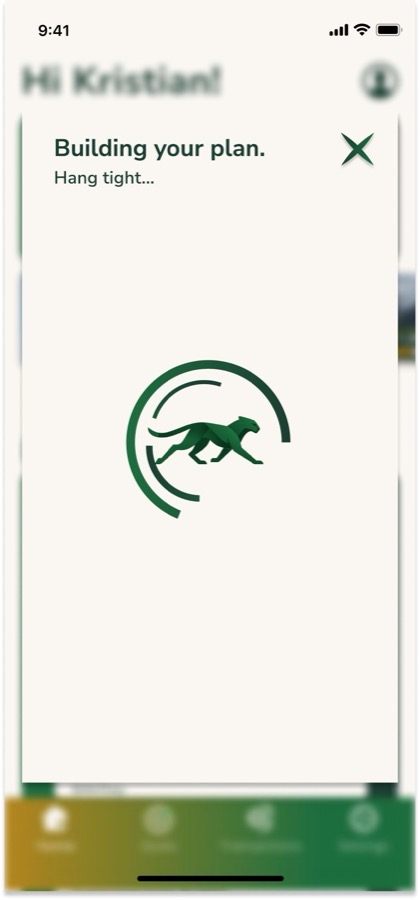
- The "Building Plan" state did not clearly communicate that work was happening
- added a visual loading indicator and clearer status messaging
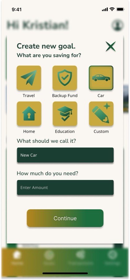
- The "+" icon was easy to miss as the entry point for creating a goal
- added supporting iconography and a text label
Contrast, readability, and tap targets were reviewed alongside the interface rather than treated as a final accessibility pass.
production note · select imagery created with generative AI