skip to content
back to work
UX RESEARCHPRODUCT DESIGNCONCEPT

Nitefind

Nightlife discovery without the decision fatigue.

Mobile product · 10 weeks · Sole designer

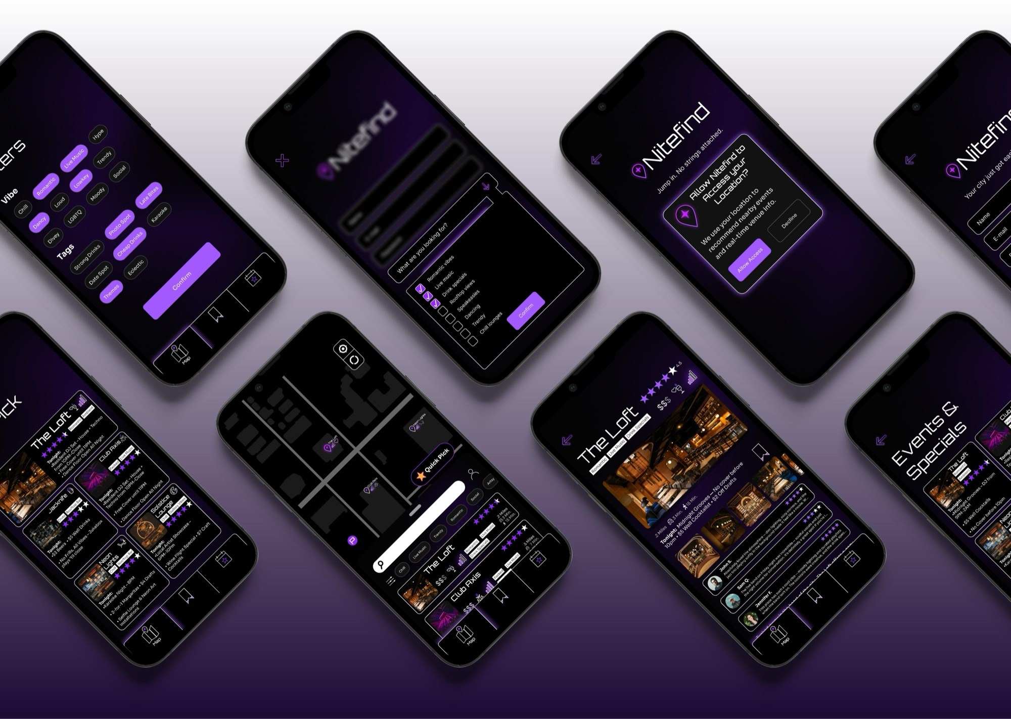
Nitefind app screens cascading across a violet gradient
01 / why this exists

Choosing where to go out shouldn’t take longer than actually going out.

People already have plenty of ways to find bars, events, and venues. The problem I found wasn’t access to options. It was piecing together enough information to trust one.

Interviews showed people bouncing between platforms to check atmosphere, crowd level, price, photos, events, and whether a place was actually worth going to. Nitefind became an exploration of how to bring those signals together without creating another overwhelming discovery app.

4 interviewsrecurring needs1 product direction
02 / the signal

The interviews pointed to three recurring needs that mattered more than demographics: speed, confidence, and discovery.

01 speed

What’s happening right now?

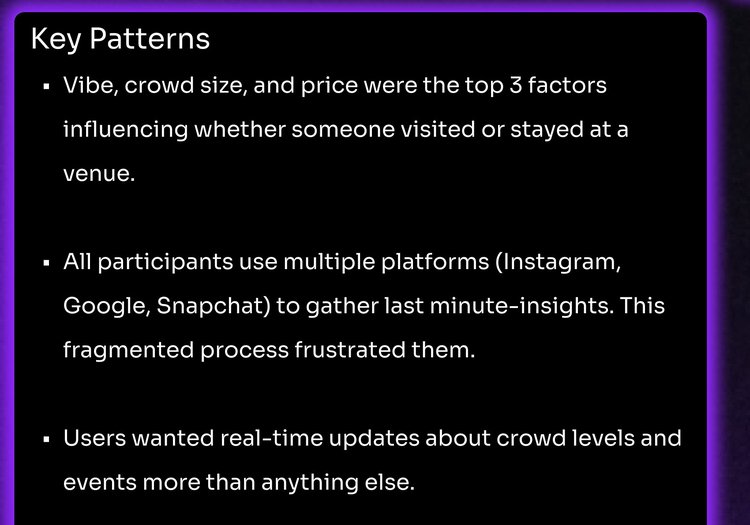
Spontaneous plans made stale information especially costly. People wanted current crowd levels, events, specials, and nearby options without checking several sources.

Research synthesis excerpt: vibe, crowd size and price as top factors, participants using multiple platforms, and demand for real-time crowd and event updates
research synthesis · excerpt
02 confidence

Will I actually like this place?

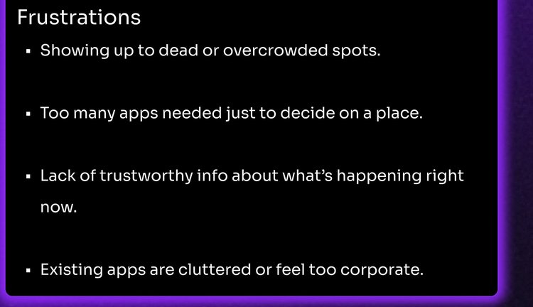
Photos weren’t enough. Vibe, crowd size, price, noise level, and atmosphere helped people decide whether a venue was worth committing to.

Research synthesis excerpt: frustrations about dead or overcrowded spots, too many apps, and untrustworthy information about what is happening right now
research synthesis · excerpt
03 discovery

Show me something that fits, not another top-ten list.

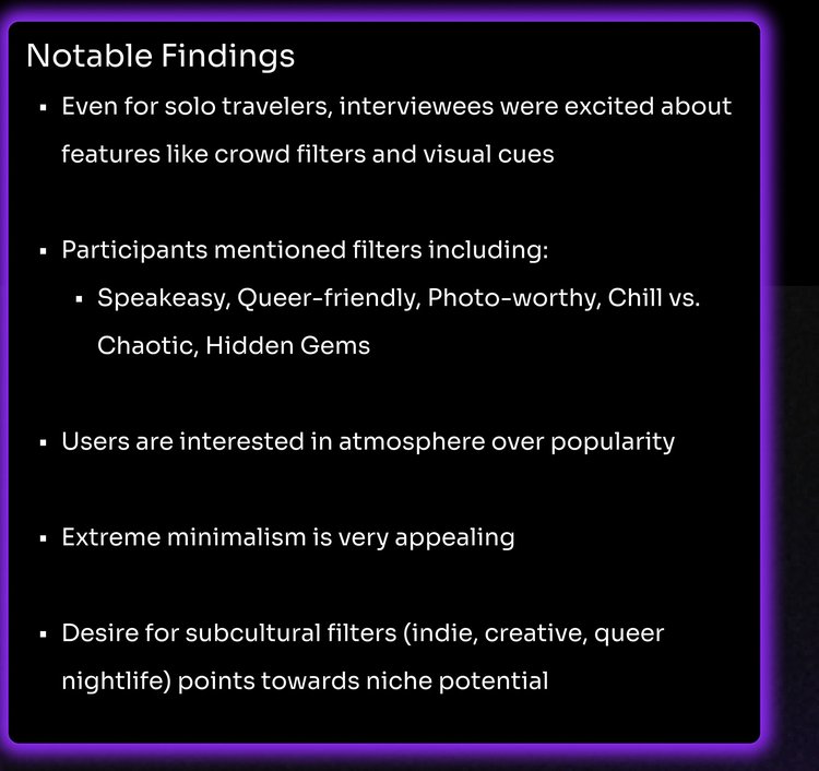
Participants described places through qualities like chill, chaotic, romantic, queer-friendly, hidden gem, photo-worthy, and speakeasy rather than conventional venue categories.

Research synthesis excerpt: notable findings listing speakeasy, queer-friendly, photo-worthy, chill versus chaotic and hidden gem filters, atmosphere over popularity, and subcultural filter interest
research synthesis · excerpt
the insight

Different behaviors pointed to the same underlying need: reduce the number of decisions between “I want to go out” and “I’m somewhere good.”

03 / key decisions
01

The research narrowed the product before I designed it.

Three recurring needs became three product priorities.

01research signal

Vibe before category

People described the night they wanted more naturally through atmosphere than venue type.

product response

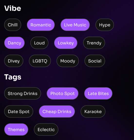
Filters centered on qualities like romantic, chill, live music, crowd level, price, and niche tags rather than relying only on traditional venue categories.
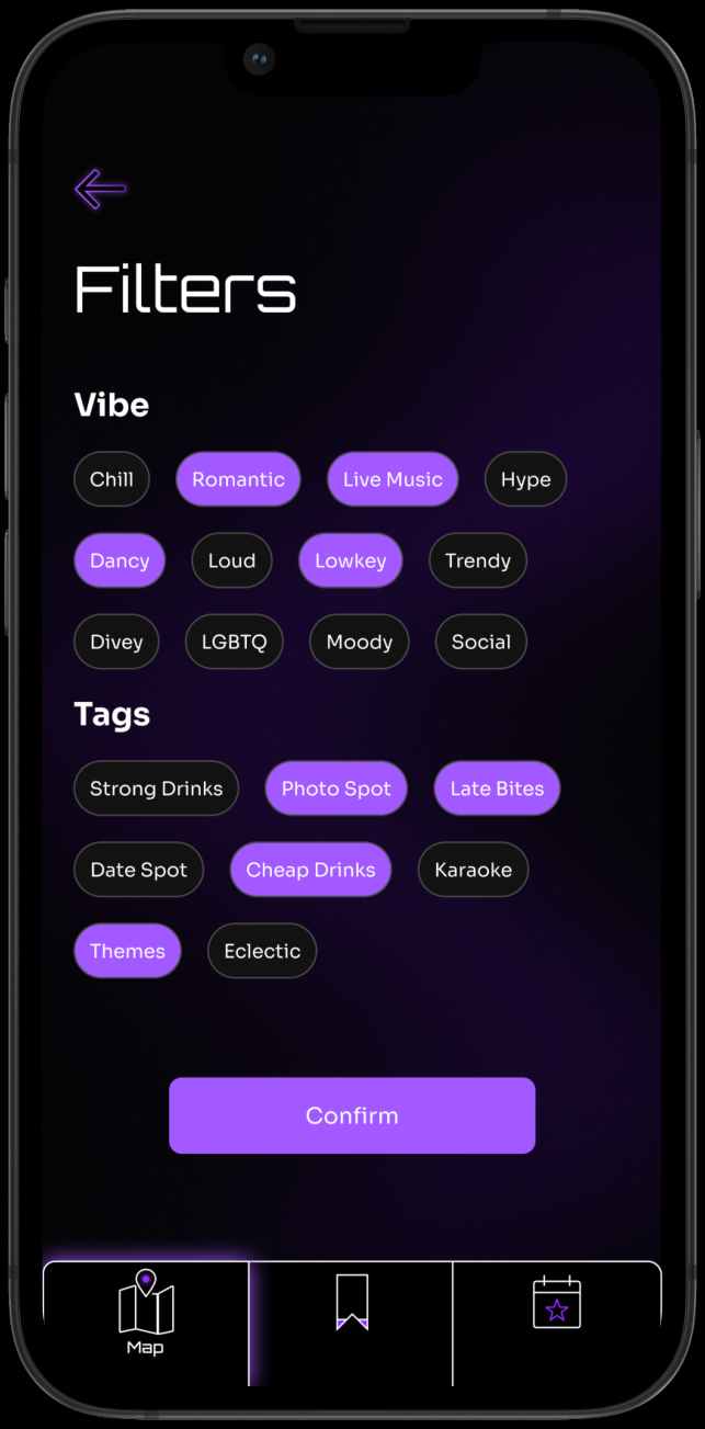
Nitefind advanced filters screen showing multiple vibe and tag filter chips
advanced filters
02research signal

What’s happening now

A good venue wasn’t useful if the information about it was stale.

product response

Crowd indicators, current events, specials, distance, travel time, and venue activity became first-class information.
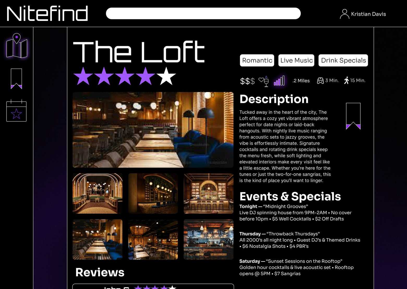
Nitefind venue detail screen for The Loft showing crowd and vibe information, price, distance and tonight’s events
venue detail · the loft
03research signal

Reduce the choice

Sometimes people didn’t want better search tools. They wanted help making the decision.

product response

Quick Pick surfaced a small set of recommendations matched to location and preferences rather than returning another long list.
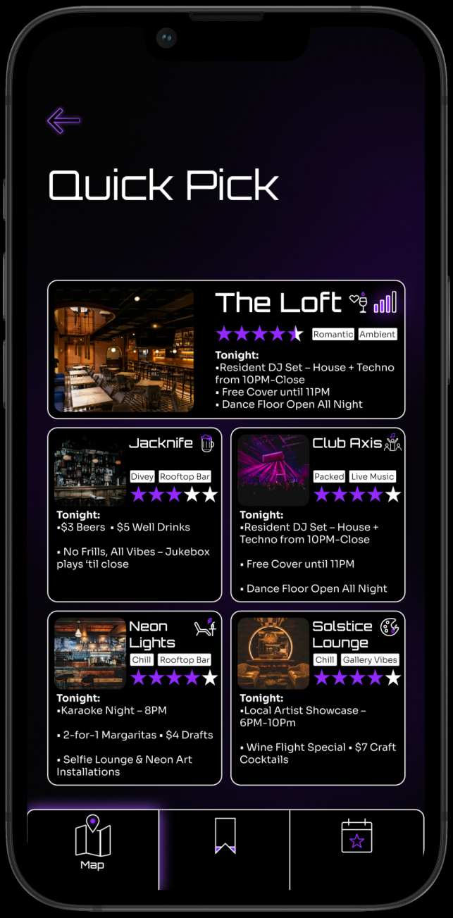
Nitefind Quick Pick screen with a featured recommendation and additional matches
quick pick
from requirements to structure

Structure before polish.

With the core signals defined, I mapped the product around three high-value moments: discovering somewhere nearby, evaluating whether it fit the night, and getting to a decision quickly.

explore

Map + filters

Early paper sketch of the Nitefind map and discovery screen
evaluate

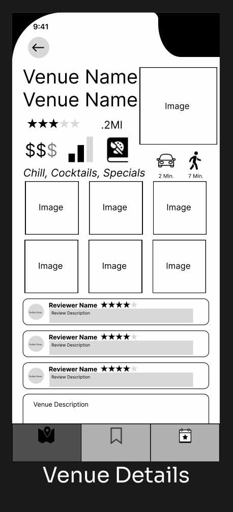
Venue details

Early paper sketch of the Nitefind venue detail screen
decide

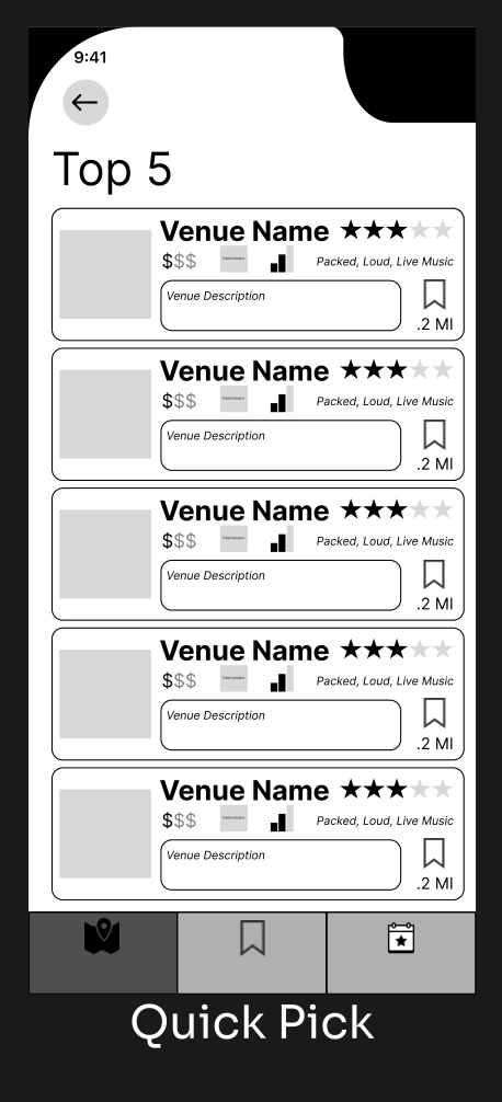
Quick Pick

Early paper sketch of the Nitefind Quick Pick recommendation flow
02

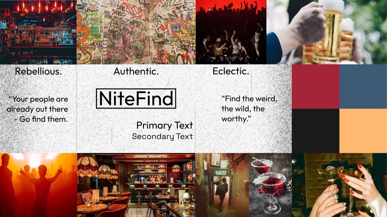
Midnight Grid over Alt Scene

Alt Scene captured nightlife more literally: eclectic, expressive, and energetic. I liked it more in isolation.

But Nitefind was supposed to reduce cognitive load. Adding another loud visual layer worked against that goal.

Midnight Grid won because the interface needed to organize nightlife, not compete with it.
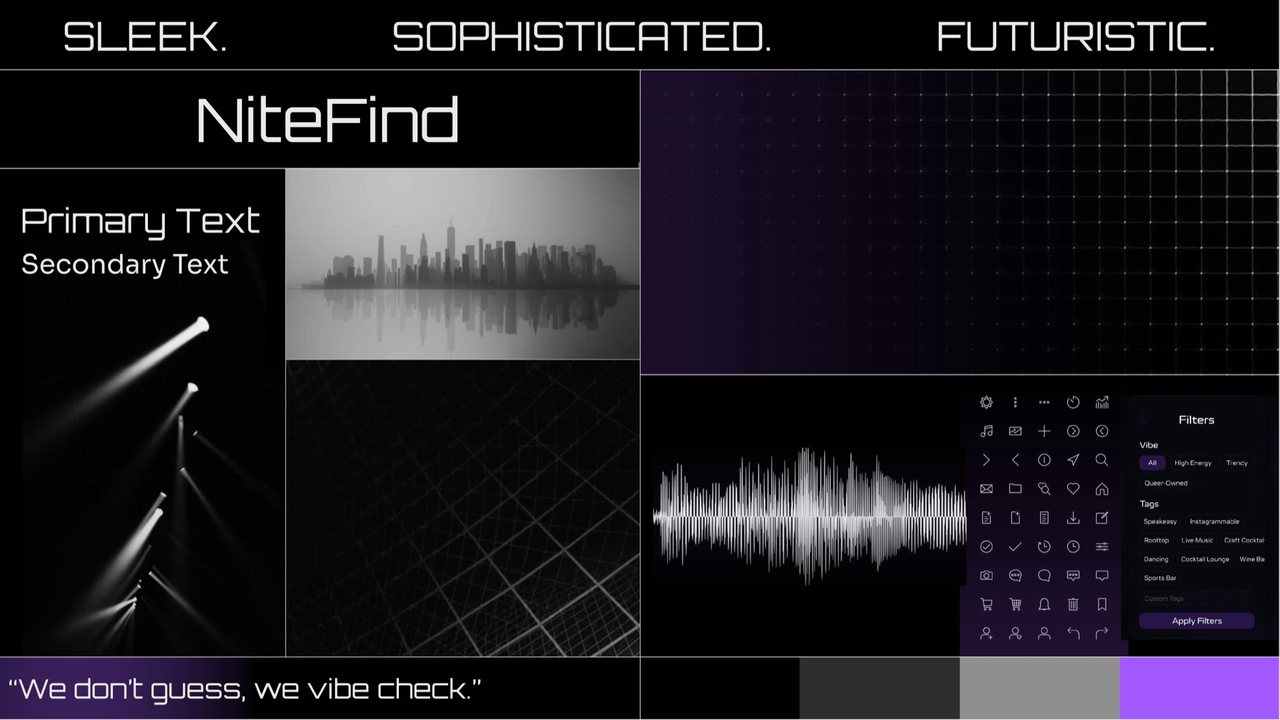
Midnight Grid mood board: black and violet, sleek, sophisticated, futuristic
Midnight Grid · chosenQuieter direction. Better product fit.
Alt Scene mood board: rebellious, authentic, eclectic, warm reds and oranges
Alt Scene · rejectedStronger personality. Weaker product fit.
03

Three tests. Four changes worth making.

3 participants · in person · mobile prototype

observationdesign response
People hesitated to share location with no context.
Added a plain-language explanation and a way to continue without sharing location.
Quick Pick didn’t clearly explain why a venue was being recommended.
Added visible preference and filter context so the recommendation felt less arbitrary.
Saving a venue lacked clear feedback.
Added confirmation and a dedicated destination for saved venues.
Advanced filters weren’t specific enough.
Expanded the vocabulary toward more descriptive and niche qualities.

the fix, in the product
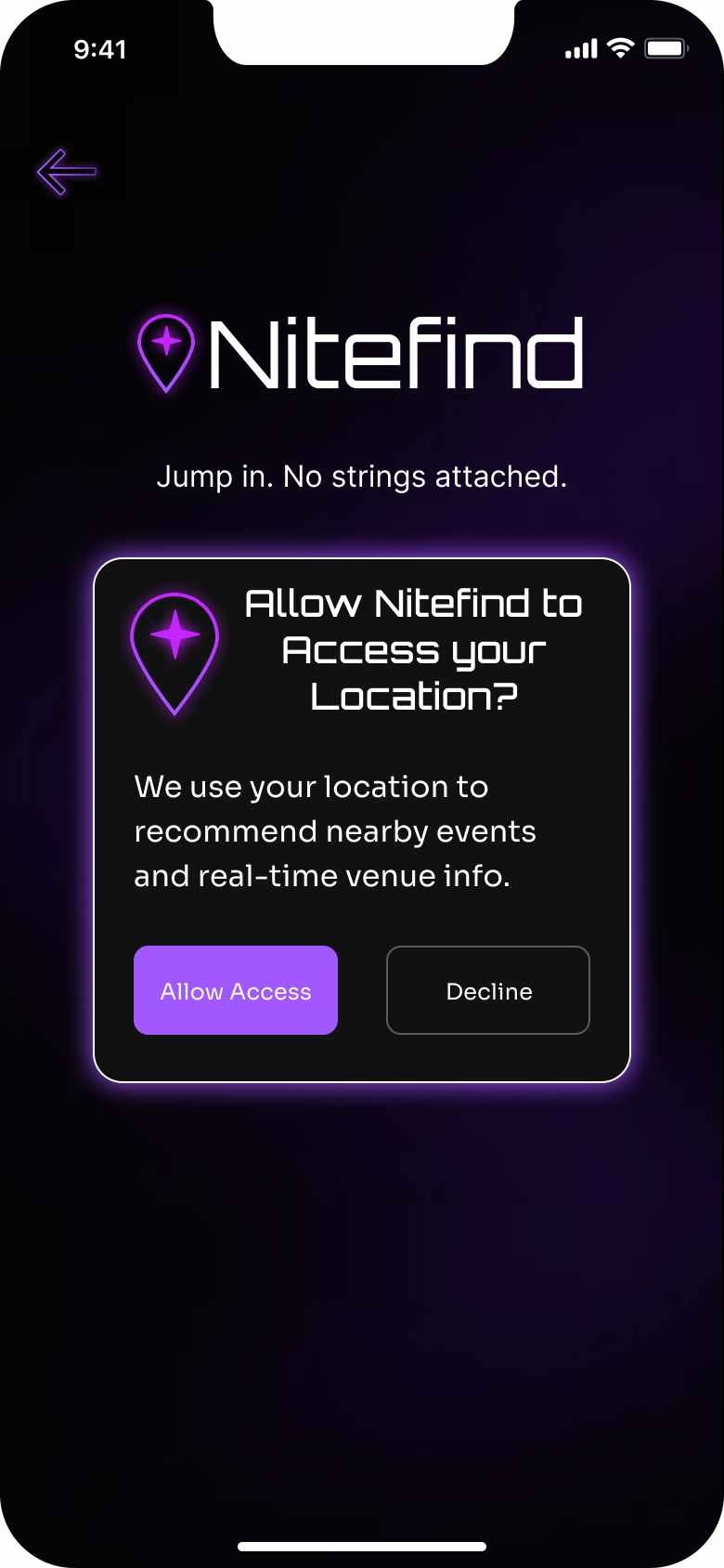
01 · location context
Nitefind location permission screen with a plain-language explanation and an option to continue without sharing location
Context before permission.
02 · quick pick transparency
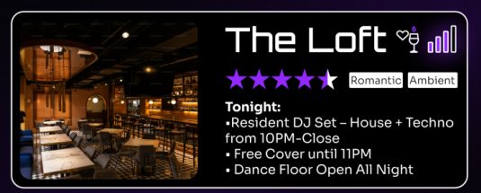
Detail of the Nitefind Quick Pick recommendation card showing rating, Romantic and Ambient tags, and tonight’s programme
Show why the recommendation fits.
03 · save feedback
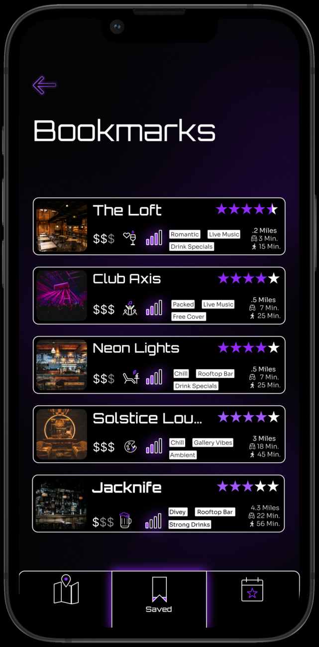
Nitefind bookmarks screen listing saved venues
Confirm the action and make it recoverable.
04 · more specific filters
Detail of the Nitefind filters screen showing the expanded vibe and tag vocabulary
Match how people actually describe a night out.
04 / the product

Less searching. More deciding.

The final product organizes discovery around the information people said they needed before committing to a place.

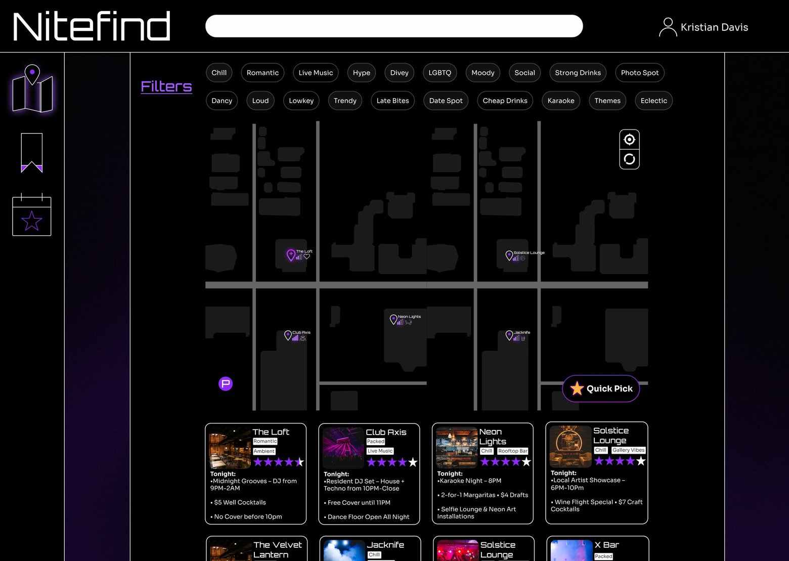
find

Start with what’s nearby.

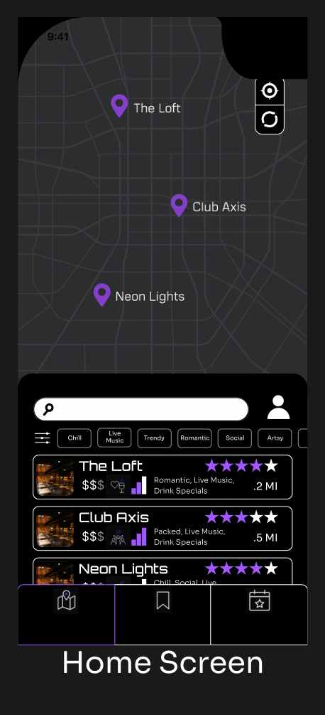
Location, crowd level, price, vibe, and distance make the map useful before opening a venue.

Nitefind map and discovery screen with venue pins, vibe filters, and price and distance information
filter

Describe the night, not the category.

Vibe and niche filters let people narrow options using the qualities that surfaced during research.

Nitefind advanced filters screen with a readable vibe and niche filter vocabulary
evaluate

Put decision-making information up front.

Atmosphere, crowd level, pricing, travel time, events, specials, and imagery answer questions people were already checking elsewhere.

Nitefind venue detail page for The Loft with gallery, atmosphere and crowd information, pricing, events and specials
decide

When choosing is the problem, reduce the choices.

Quick Pick turns preferences and location into a short recommendation set instead of another long results list.

Nitefind Quick Pick screen with a featured recommendation and a short set of alternates
Nitefind bookmarks screen listing saved venues
save

Keep “maybe later” easy to recover.

05 / responsive design

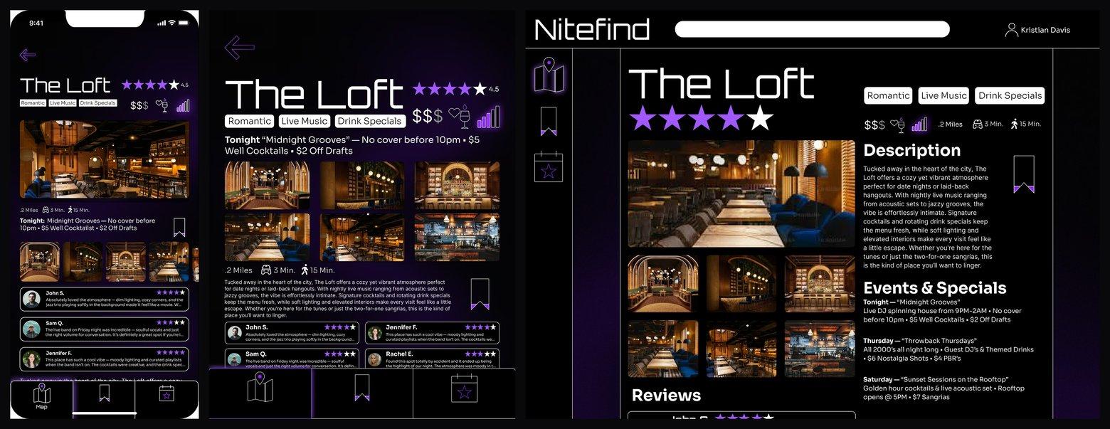
Same decision hierarchy, more room.

Larger breakpoints created room for imagery, events, and supporting information without changing what mattered first. The hierarchy stayed centered on answering the same question: is this somewhere I want to go?

The Loft venue page shown across mobile, tablet and desktop breakpoints
06 / looking back

What I’d do differently now.

Nitefind taught me that research doesn’t need to produce more artifacts. It needs to make the next decision clearer.

If I continued the project, I’d recruit a broader participant group and test the core recommendation model more deeply, particularly how much people trust crowd data and why Quick Pick recommends a venue.

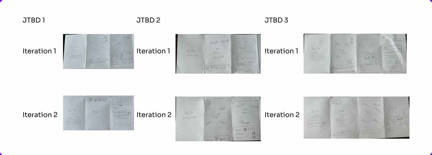
I’d also move into rough sketches sooner. I spent too much time refining early layout directions before proving the underlying structure.

The biggest takeaway wasn’t a feature or screen. It was learning to ask whether every design decision reduces uncertainty or adds another thing for the user to process.

Early rough layout iterations: two sketch passes across three jobs to be done
early layout iterations