
skip to content
back to work
UX / UI DESIGN MOBILE APP CONCEPT

SmiteForge

A Smite 2 companion app designed for iOS and Android without making either feel like the other.

Mobile companion app · Sole designer

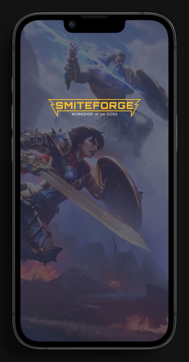
The SmiteForge splash screen shown on an Android phone and an iOS phone, over blurred Smite key art
01 / why this exists

Smite information existed. Getting to it quickly on a phone was the problem.

Fan resources already offered plenty of information, but much of it was dense and designed around desktop browsing.

SmiteForge explored a faster mobile reference for checking gods, builds, and player information mid-match or between games.

3 player interviews 1 preference survey 2 platform languages
02 / the signal

I spoke with three Smite players, ran a feature-preference survey, and worked with one recurring tester throughout the project.

Elias Rivera
hardcore player
Elias Rivera

“I like seeing the numbers behind my builds. If I’m improving, I want to know why.”

Plays frequently and pays attention to builds, stats, and performance.

needs
  • Fast access to god stats
  • Saved builds
  • Clear match history
avoid
  • Dense mobile resources
  • Ads and distractions
  • Digging for information
Alyssa Moore
casual player
Alyssa Moore

“I just want to grab a god and go. Give me the info fast, then let me play.”

Plays casually with friends and wants enough information to make a confident choice without studying the game.

needs
  • Quick build references
  • Easy-to-scan god information
  • Simple ways to learn unfamiliar gods
avoid
  • Overwhelming guides
  • Outdated information
  • Long explanations
the insight

Different depth, same ask: get out of the way.

03 / key decisions
01

One brand, two platform languages

The content and identity stayed consistent. The interface language changed with the platform.

iOS uses SF Pro, softer containers, and more generous edge spacing.

Android uses Roboto, stronger blocks, depth, and color to create a more structured hierarchy.

These are design interpretations informed by each platform, not claims about universal iOS or Android rules.

Both versions are compared side by side below.
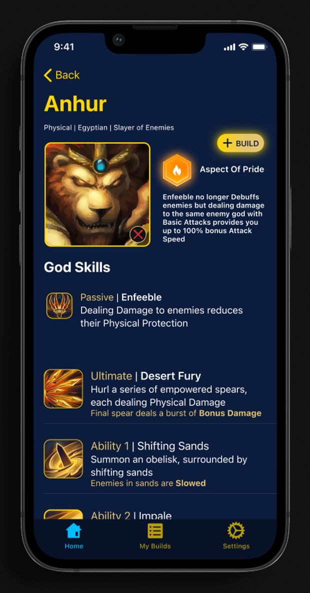
God detail on iOS
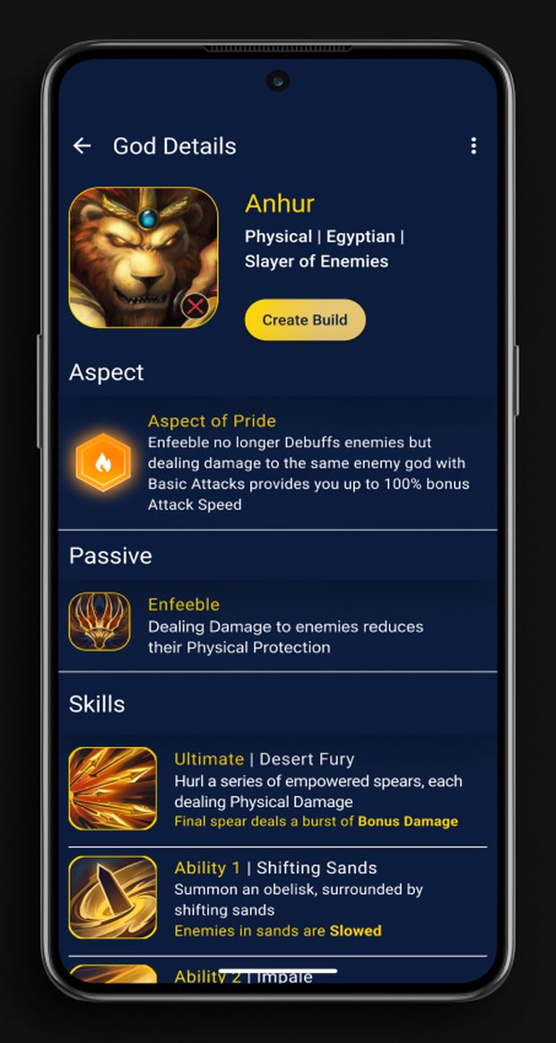
God detail on Android
02

Make it feel connected to Smite

Gold and blue borrow from Smite’s visual world, helping the companion app feel connected to the game without simply reproducing its interface.

SmiteForge then uses its own typography, containers, spacing, and interaction patterns to create a distinct product system.

SmiteForge references visual content from the Smite universe sourced from public fan and wiki material. I do not own this content. Original icons shown in the project are my own designs.

03

Testing changed the interface

Testing surfaced two real problems. Each led to a specific change.

observationdesign response
Players couldn’t immediately tell what SmiteForge was for.
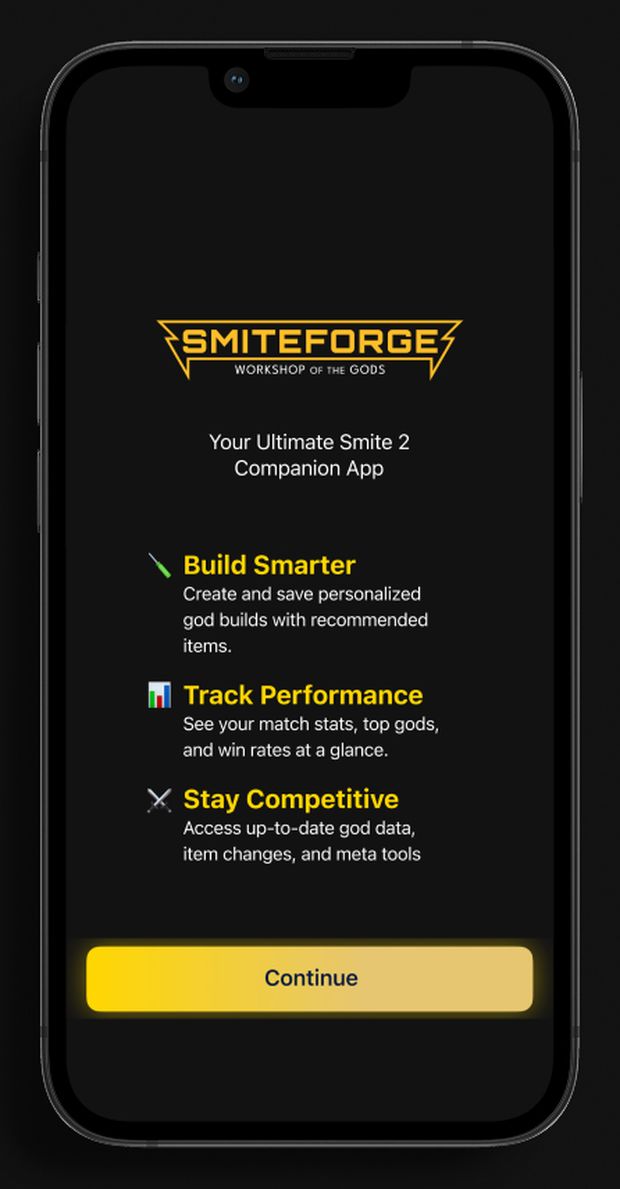
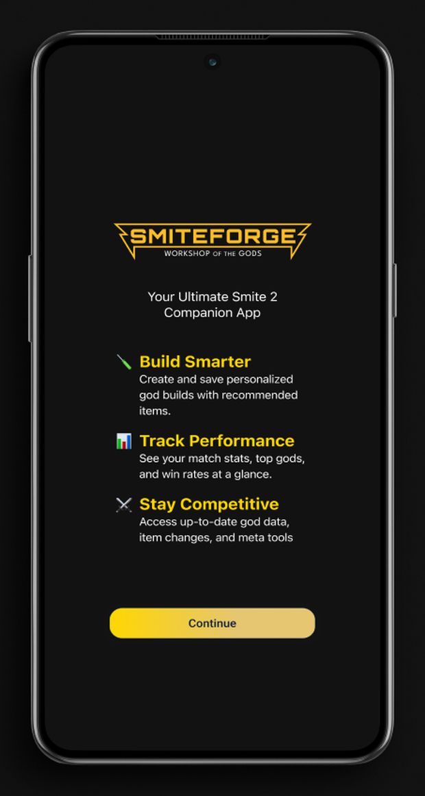
Added a short onboarding sequence that introduces the product before players enter the main interface.
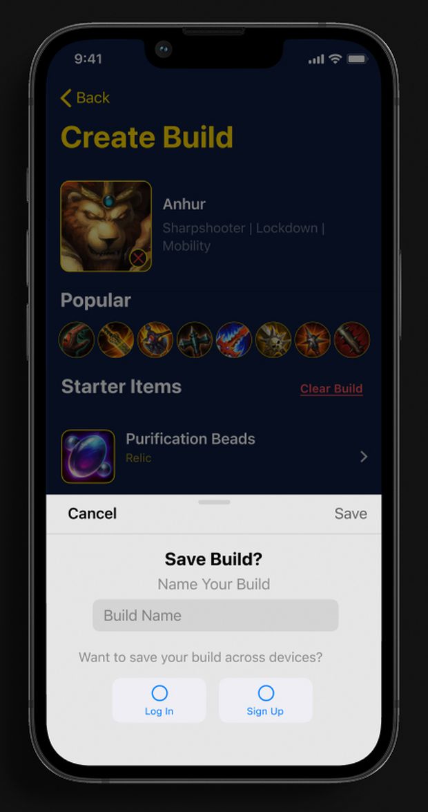
Logged-out players reached the save flow without realizing an account was required.
Made the account requirement explicit at the moment of saving, with clear Log In and Sign Up paths.

Both fixes appear in the platform comparison below: onboarding first, followed by the account-gated Save Build flow.
04 / side by side

The same core tasks carried across both versions while typography, spacing, containers, navigation, and hierarchy adapted to each platform.

iOSAndroid
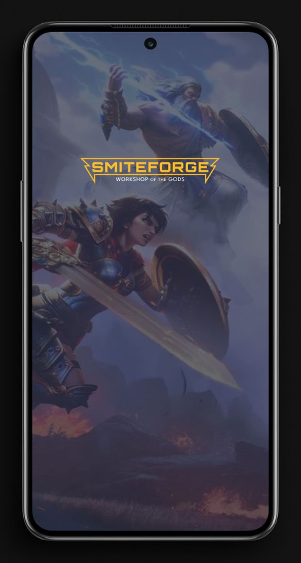
Splash on iOS
Splash on Android
SplashSame visual identity, presented within each platform’s device context.
iOSAndroid
Onboarding on iOS
Onboarding on Android
OnboardingThe same product introduction, adapted to each platform before players enter the interface.
iOSAndroid
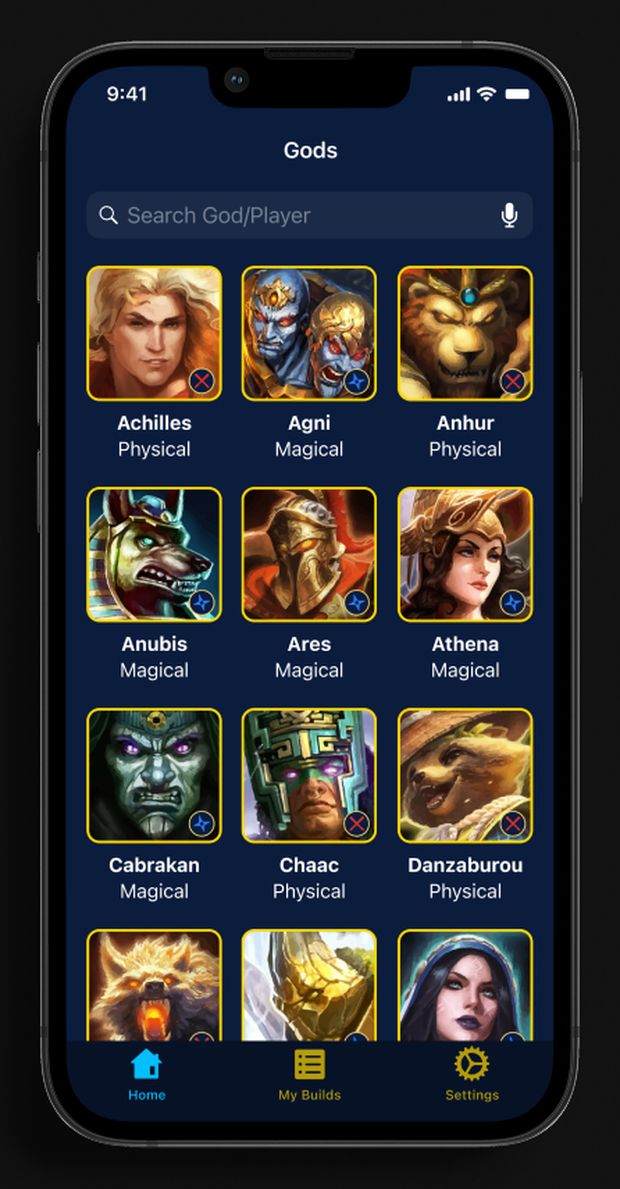
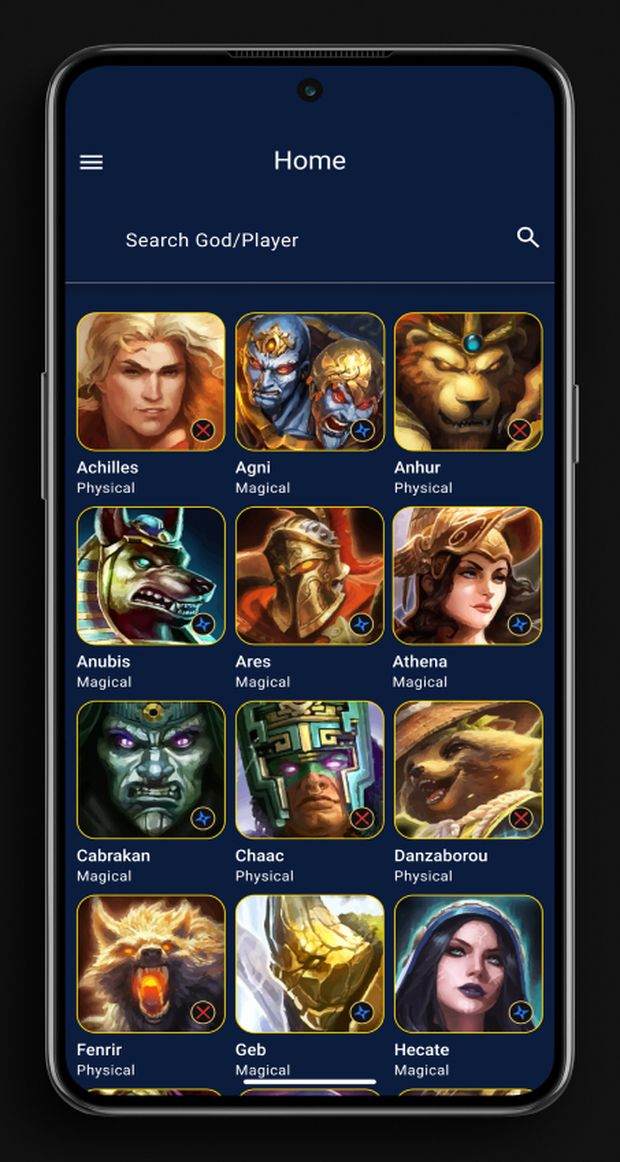
God browse on iOS
God browse on Android
God browseiOS keeps navigation compact and centered. Android gives search greater prominence and uses a different top-level navigation pattern.
iOSAndroid
God detail on iOS
God detail on Android
God detailThe same information hierarchy expressed through softer stacked containers on iOS and more defined sections on Android.
iOSAndroid
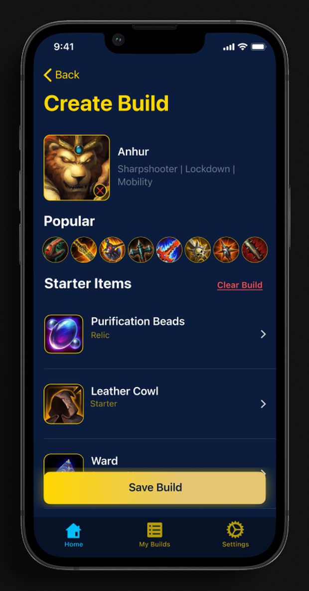
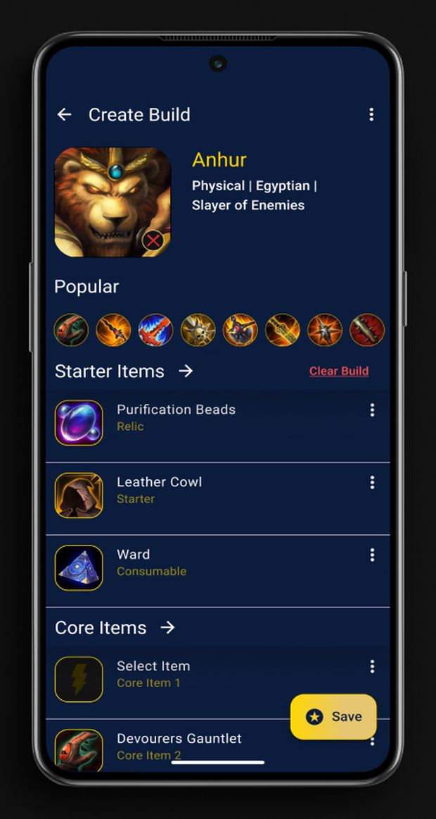
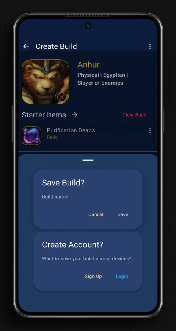
Create build on iOS
Create build on Android
Create buildThe same build task on both platforms, with spacing, rows, and actions adapted to each interface system.
iOSAndroid
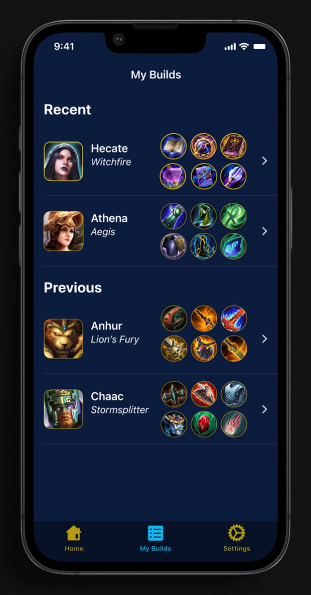
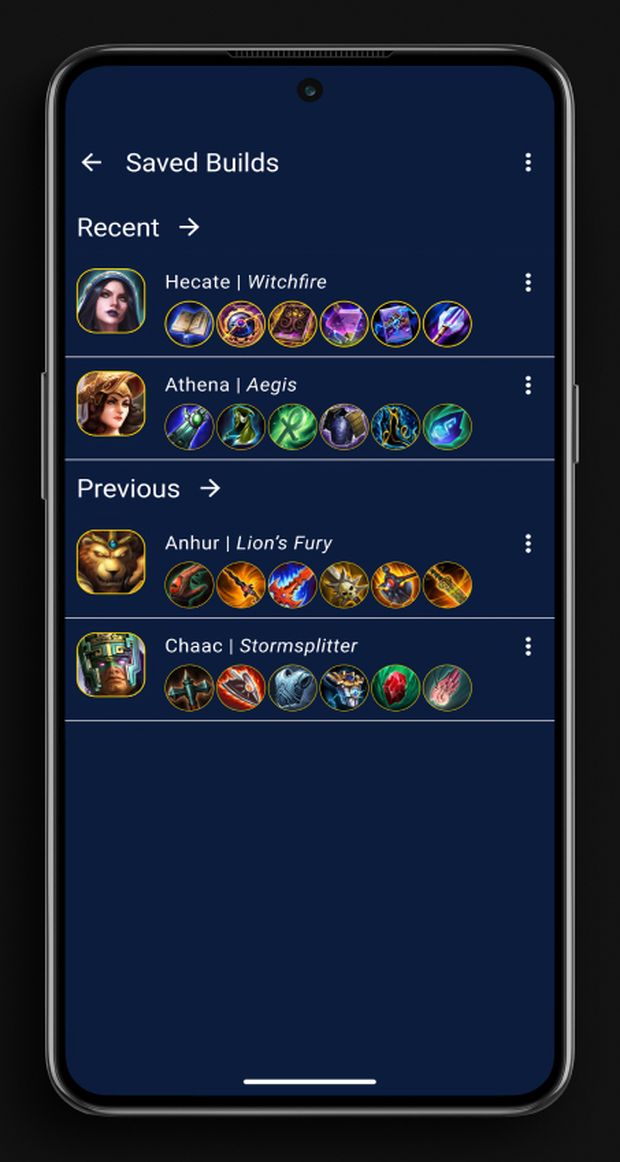
Saved builds on iOS
Saved builds on Android
Saved buildsThe same saved-build information, organized through different row treatments and hierarchy.
iOSAndroid
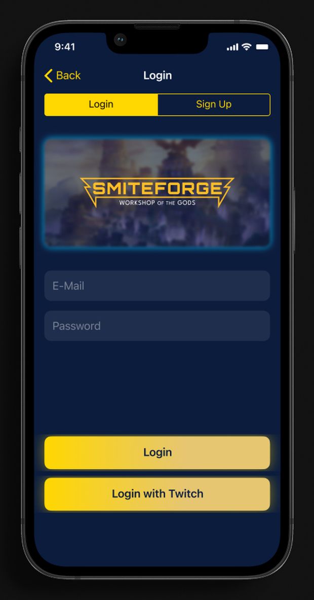
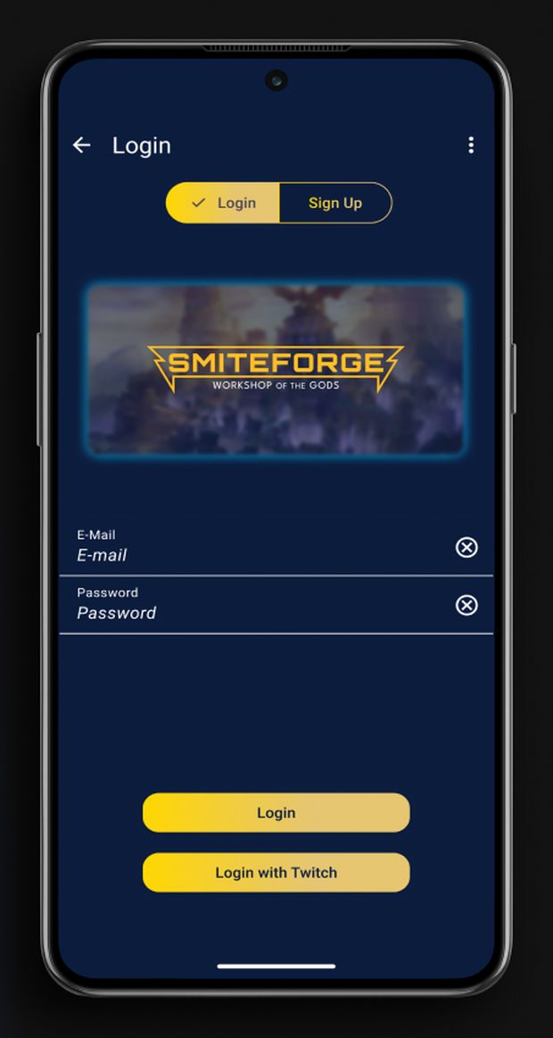
Login on iOS
Login on Android
LoginThe same authentication flow expressed through different control and form treatments.
iOSAndroid
Save build on iOS
Save build on Android
Save buildThe testing fix in context: both versions make the account requirement explicit before a build can be saved.
05 / where it stands

Concept work, not shipped.

SmiteForge changed how I think about cross-platform design. Consistency doesn’t require identical interfaces. The product, hierarchy, and core tasks can stay consistent while each platform speaks its own visual and interaction language.

If I continued the project, I’d test those differences more deliberately with people who regularly use each platform. I made informed decisions around navigation, spacing, hierarchy, and controls, but deeper platform-specific testing would show which differences actually improve usability and which are simply visual conventions.

The biggest takeaway was learning to separate what should stay consistent from what should adapt. A design system should protect the product’s identity and logic without forcing every platform into the same interface.